

Most management dashboards fail for the same reason: nobody trusts the numbers. A figure looks wrong, someone checks it, the underlying integration turns out to have been failing for a fortnight, and from then on the dashboard is decoration. Reporting is only as good as the honesty of its plumbing.
Status: product concept, in active development. This is something we are building, not something you can buy today. We publish our roadmap because the engineering thinking behind it is the useful part — and because we would rather show you the design than imply a finished product.
Designed Capabilities
- Executive KPI scorecards — the handful of numbers that actually run the business.
- Sales and backlog analysis — what is sold and what remains to deliver.
- Labor capacity and utilization — whether the work can be staffed.
- Project and service profitability — margin where it is earned or lost.
- Inventory and procurement health — what is committed and what is stuck.
- Billing and cash collection — revenue recognised versus money received.
- Customer satisfaction and risk — accounts worth attention before they churn.
- Drill-through lineage and explainable forecasting — every number traceable to its source.
It Reports on Its Own Reliability
The distinguishing design decision is that the platform tracks integration failures and data-quality problems as first-class information. A leader should be able to see not just the number, but whether the number can be believed today. Dashboards that hide their own gaps are worse than no dashboard.
Tell us if this matches a problem you have — early input shapes what we build first, and we will give you an honest view of where it stands.
Related services
- Business Reporting and Analytics — Reporting we deliver today, while the command center is in development: business reporting and analytics.
Every Number Should Carry an As-Of Stamp
A figure on an executive screen answers a question the reader did not ask: is this current? Without a visible refresh time and a named source, the reader supplies an assumption, and an assumption is the thing the screen was built to replace.
Putting refresh time and source on every tile is a decision made once, and it heads off the argument that otherwise ends with someone opening the ERP to check by hand.
Nothing Here Is for Sale Yet
The Executive Operations Command Center is not built. There is no version to buy, license, pilot or trial. The reporting practice behind it, including drill-through lineage and data quality monitoring, is delivered now under Business Reporting and Analytics. If you need executive visibility this quarter, that is the route.
Forecasts People Are Willing to Argue With
A projection that exposes its inputs, its assumptions and the records behind it can be challenged, corrected and then relied on. One that arrives as a single confident figure from a model nobody can open gets treated as an opinion with a chart attached.
That is why explainability sits among the design constraints here. A forecast a leadership team can pull apart in a meeting is the one that changes a decision.
Board and Lender Reporting Is a Different Job
Operating dashboards and reporting to a bank, a bonding company or a board make different demands. External reporting needs a fixed period end, a version that does not change after it is issued, and a reconciliation to the financial statements. Operating dashboards need to move as the week moves.
Serving both from one artifact tends to produce something that is late for operations and unstable for finance. Decide which one you are building first, and let the other one borrow from it later.
When a Consolidated View Is Worth Building
The case gets strong when the answer lives across systems that disagree with each other, or when the monthly reconciliation is performed by a person with a spreadsheet and a good memory. That is the shape this is designed around.
If you can already get margin by job, backlog and cash position out of a single ERP without exporting anything, a separate command center is a layer you would be maintaining for limited gain.
Frequently Asked Questions
What is the Executive Operations Command Center, and what is it not?
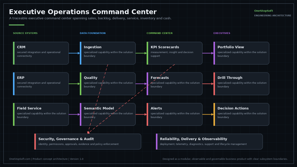
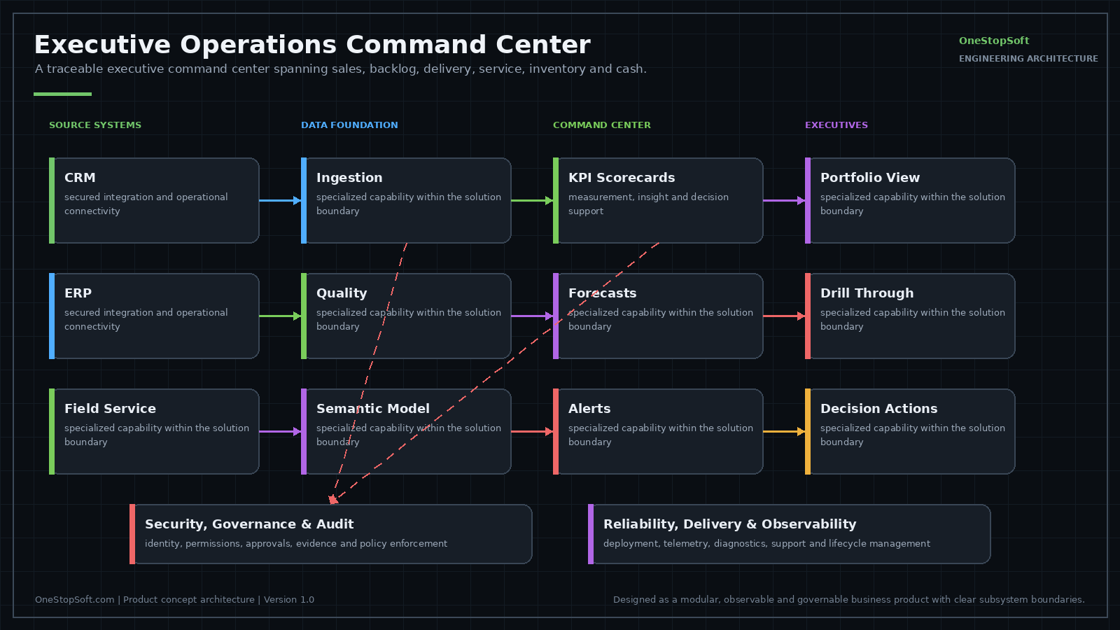
It is designed as a read layer over the systems that already hold the records: scheduled extracts, a governed set of measure definitions, and a presentation surface that carries lineage back to the source row. What it is not matters as much. It is not a system of record, so nothing originates in it that does not already exist somewhere else. It is not a write-back layer, so it does not push corrections into the ERP or the CRM. And it is not self-serve BI where any user authors a new measure; definitions are governed centrally so two screens cannot disagree about what margin means.
What does it connect to, and what has to already exist on our side?
It is designed to read from the systems that already produce the numbers: accounting or ERP for general ledger, receivables and job cost; CRM for pipeline and bookings; field service or dispatch for labor hours; procurement and inventory; timekeeping and payroll. On your side, each source needs a read path that survives a vendor upgrade: a documented REST or OData endpoint, an ODBC or JDBC connection to a replica, or a scheduled export to a location the extract job can reach. Each also needs a read-only service account and a stable key (customer, job, employee) that matches records across systems. Where no shared key exists, someone has to maintain a crosswalk. A number nobody records anywhere today cannot be reported until it is captured.
In what order is a rollout designed to proceed?
First, agree the short list of measures and write down each definition. Second, build a source inventory: for every measure, name the system of record, the field, and how often it changes. Third, arrange connectivity, meaning read-only credentials, the network path, and where the extract job runs. Fourth, take one source end to end and reconcile it against a report finance already trusts before adding a second. Fifth, add the remaining sources one at a time, each reconciled the same way. Sixth, turn the data quality monitors on before leadership sees the screen, so the first failure is visible rather than discovered later. That is a design order rather than a plan you can start, since the product is still in development.
How is it designed to fit the systems we already run?
It is designed to be additive and read-only: no schema changes in the source database, no plugin installed inside the ERP, no change to how anyone works in the CRM. Where a vendor exposes an API the extract uses it, and where it does not, it uses a replica or a scheduled export, so the constraint shows up as refresh cadence rather than as a request to modify the source. Sign-in is designed to use the directory you already have through Microsoft 365, so there is no second user list to maintain and no separate step to remember when someone leaves.
Where would the data live, and what stays under our control?
The design position is that the source systems remain the source of truth and remain yours. The platform is designed to hold the extracted fields it needs plus the calculation history behind each figure, not a mirror of the whole ERP. Access is designed to be role based and inherited from your directory groups, so the access review you already run governs the dashboard as well. Connections run on read-only service accounts you create, rotate, and can revoke, and revoking one stops the feed without touching a record in the source. Row-level limits, such as a branch manager seeing only their branch, have to key off a field that already exists in a source system.
What would we have to decide or provide?
The decisions are the harder half. You would settle the definition of each measure where systems disagree, for example whether backlog means signed contract value or signed value less what has already been billed, and the point at which the operating view treats revenue as earned. You would also decide which system holds the frozen issued version once a period is closed, because the operating model and the issued external pack diverge from that moment on. What you would provide is read access and a technical contact per source, documentation of custom fields and any local conventions, and one person with the authority to settle definition disputes.
What happens when two systems give different answers for the same measure?
That is the normal case, not the exception. CRM and ERP bookings differ because one counts at signature and the other at job setup, or because one includes freight and tax and the other does not. Inventory differs because a receipt is posted in one place and not yet in the other. The design fixes this at the start by naming a single system of record per measure and presenting the other system as a stated variance rather than a competing number, with drill-through showing which system and which field produced the figure on screen. Reconciling that variance then becomes a standing task with an owner, rather than something found at the moment a decision depends on it.
How current can the numbers be?
The design assumes refresh is bounded by the slowest source, not by the dashboard. An ERP that only publishes a nightly extract, an API with page size and rate limits, a report server locked during close: each of those sets a floor for anything derived from it. A measure that mixes a source refreshed hourly with one refreshed nightly is only as current as the nightly one, and the design treats that inherited staleness as a property of the measure rather than something to average away. Cadence is therefore set per source during design, and a measure that cannot support a daily view is better built as a weekly figure than presented as if it moved with the day.